

This week the Los Angeles Times created a very impressive visualization of every shot made by Kobe Bryant in his long career. Every Shot Kobe Bryant Ever Took allows you to explore a shot map of Kobe Bryant's 30,699 career shots, both successful and misses.
The map was made with CartoDB and Leaflet.js, which means you can pan around the shot map and zoom in and out like you can on any other interactive map. You can also interact with all the shot map markers. The purple dot markers on the map indicate his successful shots and the yellow dots show his misses. You can even mouse-over any of the dots on the map to find out which game it was made in, the distance of the shot and the date of the game.

Urbica also released a very impressive mapped data visualization this week. The NYC Citi Bike Rebalancing Study visualizes popular trips taken on NYC's Citi Bike network, re-balancing routes (where bikes are moved from station to station) and individual bike docking station profiles.
One of the biggest problems facing bike-sharing networks, such as New York's Citi Bike, is re-balancing the bikes in the docking stations. Bikes need to be moved around the docking stations to ensure that stations are not empty and that bikes are always available. Uneven demand and daily traffic flows (particularly during peak commuting times) can prevent bike-share networks reaching their full potential.
There are two visualization modes on the map. The 'Trips vs Rebalancing' mode allows you to view trip routes and compare this to the re-balanced bicycle routes. If you select an individual station on the map you can also view the average availability of bikes at the station over 24 hours.
The 'Station Availability' mode shows the percent of bikes available at stations for any hour of the day. If you use the timeline at the bottom of the map you can see how the availability of bikes at each station changes over the course of the day.
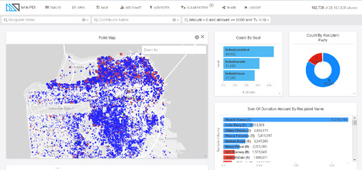
The MapD Political Donations map visualizes 25 years worth of political donations data on a Mapbox GL powered interactive map. Using the map you can explore where and how much Americans have donated to the Democrats and Republicans since 990.
Zoom-in on the map and you can see locations where political donations have been made. Blue dots on the map show donations made to Democratic candidates and red dots show donations to Republicans. The size of the dots represent the relative size of each donation.
Beside the map you can see charts showing the amounts made to each party and to individual candidates. One of the most impressive aspects of this visualization is the speed that it responds. Move the location on the map and both the map and the charts almost instantly update to show the data for the current map view.
No comments:
Post a Comment